

Back


Package Activities
My role
Role
Research & Product Design
Timeline
October 2025 – June 2026
Team
Package Holidays
Platforms
Web (Desktop & Mobile)
Long term goals

Give customers the information they need to evaluate activities confidently in order to conclude their purchase decision.
Increase the average number of activities per booking and average order value.
Design challenges
Stakeholder conversations had surfaced two core concerns: Bed banks needed to be credible enough to convert, whilst the performance of higher-margin direct supply is protected. The goal was to supplement, not compete with existing supply.
- I spoke with Lead PM to establish commercial context: where in the funnel customers were dropping off, what the average additional activity attachment rate looked like, and target metrics for a meaningful improvement.
- I learnt that the target metric is average order value, with activity upsells being an opportunity to increase that.
How might we elevate the value of directly contracted supply without diminishing bed banks?
1
2
Requirements gathering
- Baymard Institue
3
Secondary research
- I spoke to the UX Research Lead to understand the target users and the problem space.
- She shared 2 insight reports with me and recommended I viewed some of the moderated sessions she’d ran on usertesting.com.
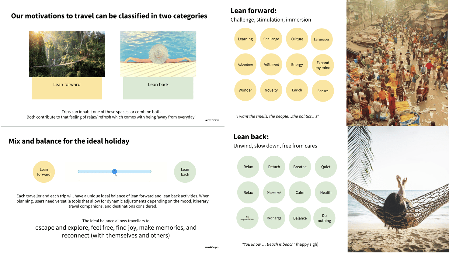
- I learnt that package bookers have two key drivers: lean forward (challenge, stimulation, learning) and lean back (rest, calm, escape from routine). The best itineraries balance them deliberately.
2
Moderated interviews
- I spoke to the UX Research Lead to learn more about the target user and package holiday problem space.
- I learnt that package bookers have two key drivers: lean forward (challenge, stimulation, learning) and lean back (rest, calm, escape from routine). The best itineraries balance them deliberately. This informed the curation logic.
Discovery
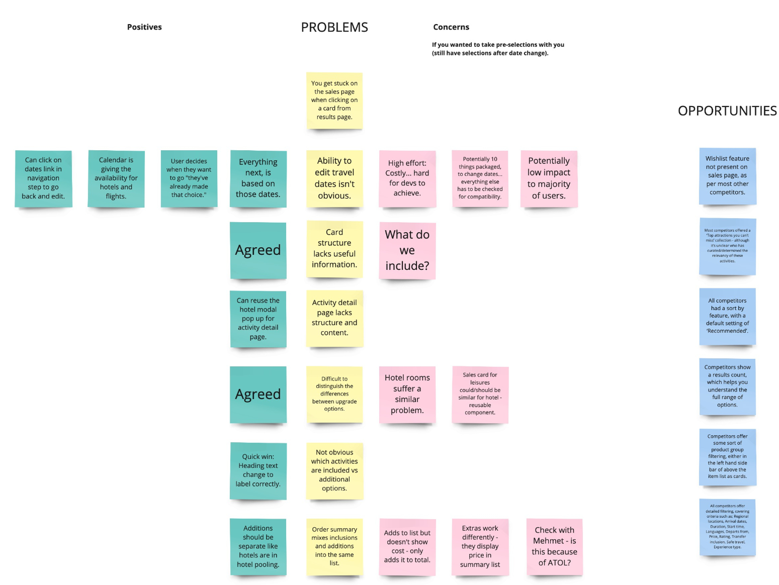
I had uncovered A LOT of issues. It was clear there was so much that could be done to make the experience better. The current design was meeting the bare minimum of what was acceptable.
I walked by product partner through the problem space, discussing each problem and note taking about the positive and negative aspects of each.
It was clear that the scope of this project would not stretch to solve all the potential issues. I created a Google Sheet which I shared with the PM, that documented all the problems I’d discovered. A useful research artefact that could be revisited another day.
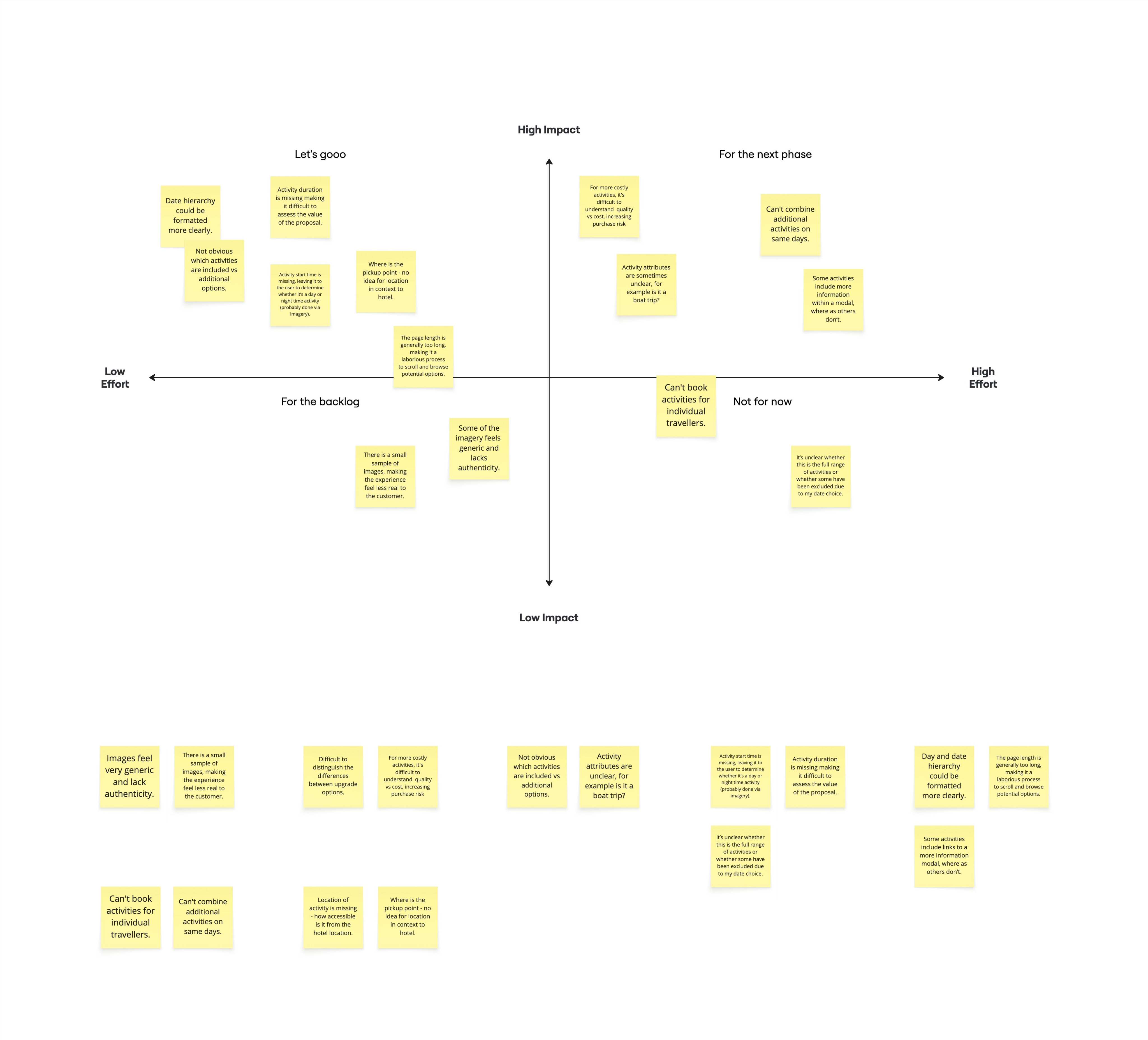
I distilled the in scoped issues into key themes. Together with Product and Engineering we mapped the themes to an impact vs. effort matrix, to understand which problems were worth focusing on first.
Speaking with the technical team, it became clear the underlying problem was a lack of structured data. With a third-party integration on the mid-to-long term roadmap, any design changes needed to work within the current data structure rather than rely on significant engineering effort.
Rather than pushing for a radical overhaul, we aimed for incremental buy-in from stakeholders, focusing on the following problems:
I distilled the individual problems into core themes – summarising the underlying problems into one overarching theme. Now the problem space hadn’t been distilled and I have clarity over each problem is was time to do some prioritisation.
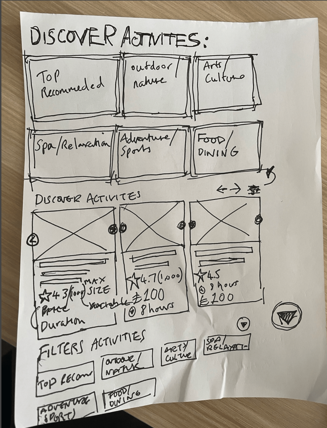
The problem space
As a package traveller with a set itinerary, I need clarity on how additional activities fit into my overall schedule, so that I can choose activities confidently without overbooking myself.
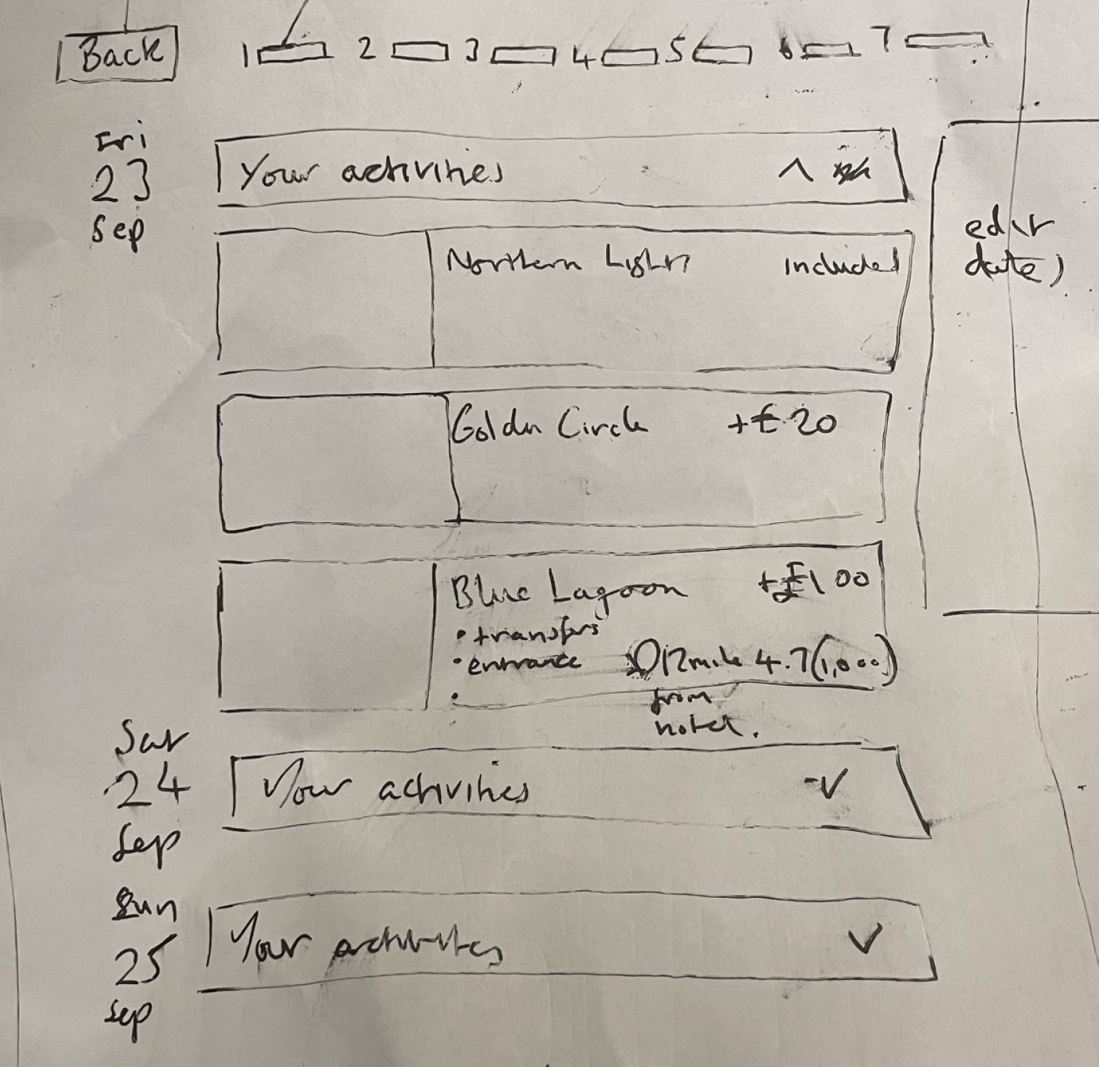
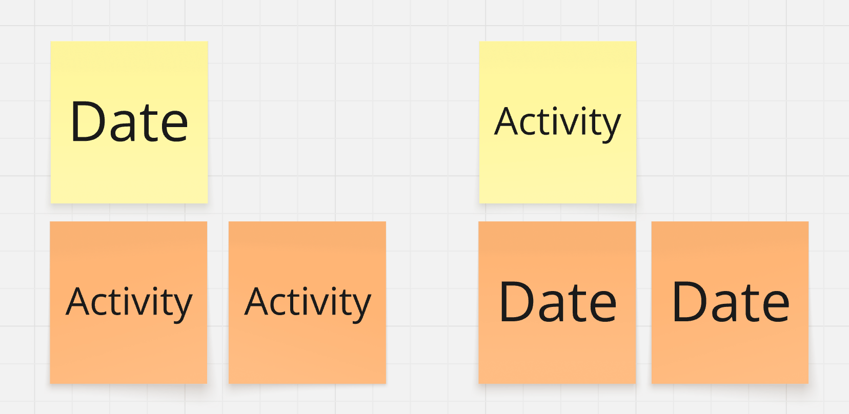
A key UX decision was the information architecture. Stakeholders wanted to lead with the full breadth of available activities, but research was clear: users care most about their itinerary and whether activities fit their schedule.
I explored an activity-first approach, but within the context of the multi-step package sales-flow, it felt overwhelming and clunky. Once stakeholders saw an activity first experience visualised within context of the sales-flow they agreed, “it felt too complex”.
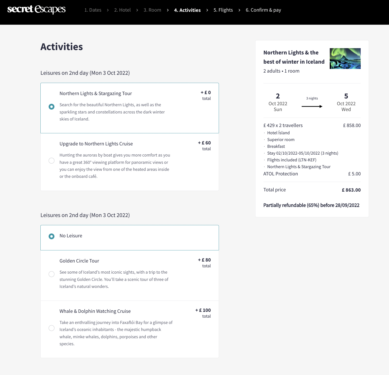
Dates-first gave the decision-making process a natural structure. Users could see availability mapped across their itinerary, then choose to dive in or save a day for relaxation – offering the ideal balance.
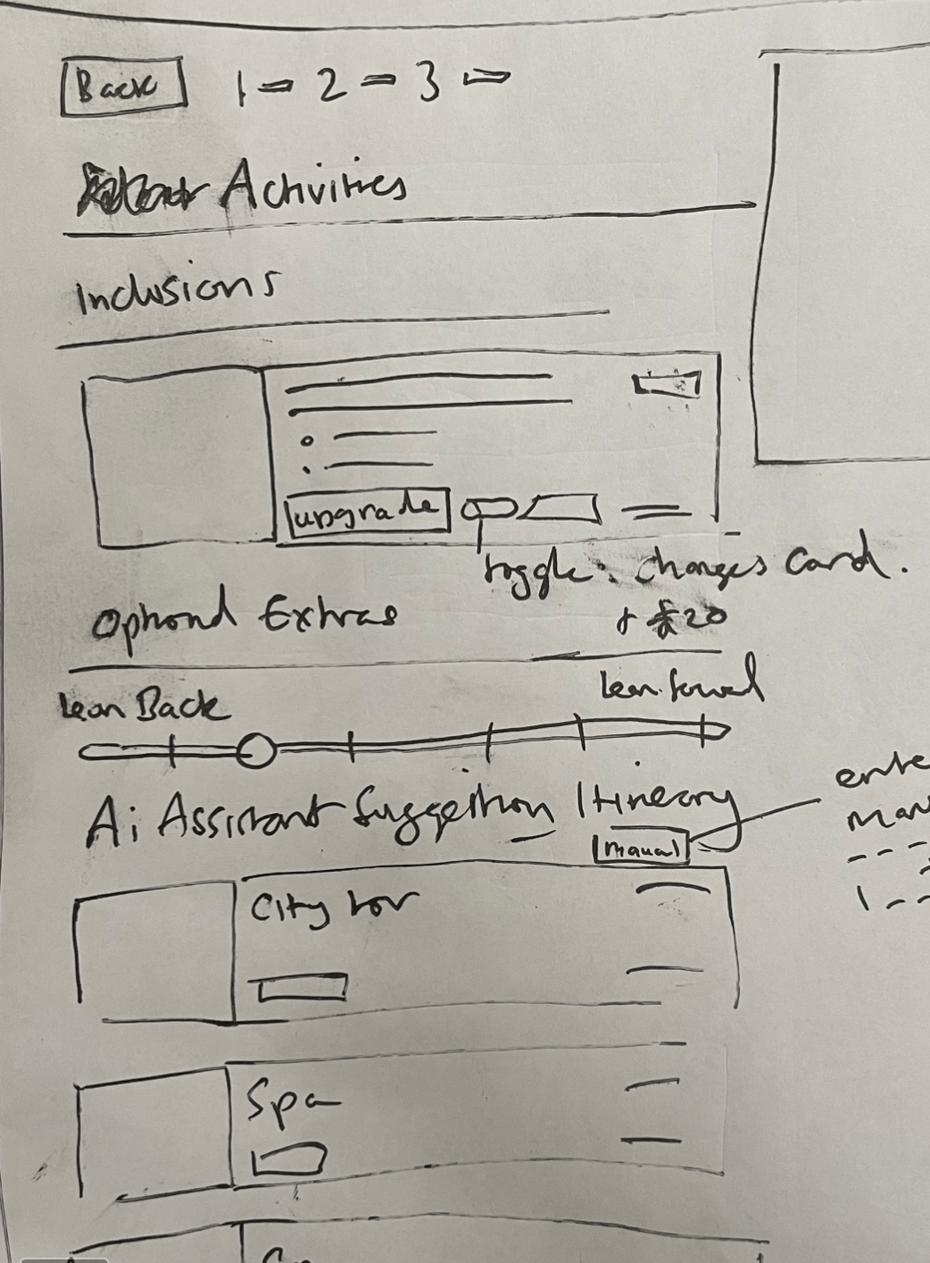
As a package traveller who wants a mix of rest and activity, I need clear expectations of what each activity entails, so I can curate my itinerary without over-committing.
As a package traveller, I want to see the duration and timing of each activity and weigh it against the price to judge whether it's worth it so that I can make sure I get the most out of my trip.
A key UX decision was the information architecture. Stakeholders wanted to lead with the full breadth of available activities, but research was clear: users care most about their itinerary and whether activities fit their schedule.
I explored an activity-first approach, but within the context of the multi-step package sales-flow, it felt overwhelming and clunky. Once stakeholders saw an activity first experience visualised within context of the sales-flow they agreed, “it felt too complex”.
Dates-first gave the decision-making process a natural structure. Users could see availability mapped across their itinerary, then choose to dive in or save a day for relaxation – offering the ideal balance.
- Curation – choosing a blend of activities that offer both.
- Filtering – surfacing preference data rather than assuming it.
- Relaxation slider: a control that populates the activity list based on a spectrum from active to restful.
The dates-first solution also speaks to this need. In user testing, one participant summed it up well — they could picture booking an activity one day, spending the next by the pool, then doing another the day after. The relaxation doesn't have to be something you book. Sometimes it's just time to do nothing at all.
A key UX decision was the information architecture. Stakeholders wanted to lead with the full breadth of available activities, but research was clear: users care most about their itinerary and whether activities fit their schedule.
I explored an activity-first approach, but within the context of the multi-step package sales-flow, it felt overwhelming and clunky. Once stakeholders saw an activity first experience visualised within context of the sales-flow they agreed, “it felt too complex”.
Dates-first gave the decision-making process a natural structure. Users could see availability mapped across their itinerary, then choose to dive in or save a day for relaxation – offering the ideal balance.
The problem space
Desktop and mobile prototypes were each tested with 12 participants via unmoderated testing. Both hypotheses were confirmed.
What worked
The dates-first format landed well on both platforms — users described it as intuitive, comparing it to a calendar or itinerary builder. Activity detail modals were easy to navigate and the list-based format was well liked. Duration proved critical: users consistently referenced it alongside price to judge value for money. Strong photography also had a noticeable impact on desirability, with several participants commenting that imagery alone made them want to book.
Back

Package Activities
My role
Role
Research & Product Design
Timeline
October 2025 – June 2026
Team
Package Holidays
Platforms
Web (Desktop & Mobile)
Long term goals
Give customers the information they need to evaluate activities confidently in order to conclude their purchase decision.
Increase the average number of activities per booking and average order value.
Discovery
Design challenges
Stakeholder conversations had surfaced two core concerns: Bed banks needed to be credible enough to convert, whilst the performance of higher-margin direct supply is protected. The goal was to supplement, not compete with existing supply.
- I spoke with Lead PM to establish commercial context: where in the funnel customers were dropping off, what the average additional activity attachment rate looked like, and target metrics for a meaningful improvement.
- I learnt that the target metric is average order value, with activity upsells being an opportunity to increase that.
How might we elevate the value of directly contracted supply without diminishing bed banks?
1
2
Requirements gathering
- Baymard Institue
3
Secondary research
- I spoke to the UX Research Lead to understand the target users and the problem space.
- She shared 2 insight reports with me and recommended I viewed some of the moderated sessions she’d ran on usertesting.com.
- I learnt that package bookers have two key drivers: lean forward (challenge, stimulation, learning) and lean back (rest, calm, escape from routine). The best itineraries balance them deliberately.
2
Moderated interviews
- I spoke to the UX Research Lead to learn more about the target user and package holiday problem space.
- I learnt that package bookers have two key drivers: lean forward (challenge, stimulation, learning) and lean back (rest, calm, escape from routine). The best itineraries balance them deliberately. This informed the curation logic.
I had uncovered A LOT of issues. It was clear there was so much that could be done to make the experience better. The current design was meeting the bare minimum of what was acceptable.
I walked by product partner through the problem space, discussing each problem and note taking about the positive and negative aspects of each.
It was clear that the scope of this project would not stretch to solve all the potential issues. I created a Google Sheet which I shared with the PM, that documented all the problems I’d discovered. A useful research artefact that could be revisited another day.
I distilled the in scoped issues into key themes. Together with Product and Engineering we mapped the themes to an impact vs. effort matrix, to understand which problems were worth focusing on first.
Speaking with the technical team, it became clear the underlying problem was a lack of structured data. With a third-party integration on the mid-to-long term roadmap, any design changes needed to work within the current data structure rather than rely on significant engineering effort.
Rather than pushing for a radical overhaul, we aimed for incremental buy-in from stakeholders, focusing on the following problems:
I distilled the individual problems into core themes – summarising the underlying problems into one overarching theme. Now the problem space hadn’t been distilled and I have clarity over each problem is was time to do some prioritisation.
The problem space
As a package traveller with a set itinerary, I need clarity on how additional activities fit into my overall schedule, so that I can choose activities confidently without overbooking myself.
A key UX decision was the information architecture. Stakeholders wanted to lead with the full breadth of available activities, but research was clear: users care most about their itinerary and whether activities fit their schedule.
I explored an activity-first approach, but within the context of the multi-step package sales-flow, it felt overwhelming and clunky. Once stakeholders saw an activity first experience visualised within context of the sales-flow they agreed, “it felt too complex”.
Dates-first gave the decision-making process a natural structure. Users could see availability mapped across their itinerary, then choose to dive in or save a day for relaxation – offering the ideal balance.
As a package traveller who wants a mix of rest and activity, I need clear expectations of what each activity entails, so I can curate my itinerary without over-committing.
As a package traveller, I want to see the duration and timing of each activity and weigh it against the price to judge whether it's worth it so that I can make sure I get the most out of my trip.
A key UX decision was the information architecture. Stakeholders wanted to lead with the full breadth of available activities, but research was clear: users care most about their itinerary and whether activities fit their schedule.
I explored an activity-first approach, but within the context of the multi-step package sales-flow, it felt overwhelming and clunky. Once stakeholders saw an activity first experience visualised within context of the sales-flow they agreed, “it felt too complex”.
Dates-first gave the decision-making process a natural structure. Users could see availability mapped across their itinerary, then choose to dive in or save a day for relaxation – offering the ideal balance.
- Curation – choosing a blend of activities that offer both.
- Filtering – surfacing preference data rather than assuming it.
- Relaxation slider: a control that populates the activity list based on a spectrum from active to restful.
The dates-first solution also speaks to this need. In user testing, one participant summed it up well — they could picture booking an activity one day, spending the next by the pool, then doing another the day after. The relaxation doesn't have to be something you book. Sometimes it's just time to do nothing at all.
A key UX decision was the information architecture. Stakeholders wanted to lead with the full breadth of available activities, but research was clear: users care most about their itinerary and whether activities fit their schedule.
I explored an activity-first approach, but within the context of the multi-step package sales-flow, it felt overwhelming and clunky. Once stakeholders saw an activity first experience visualised within context of the sales-flow they agreed, “it felt too complex”.
Dates-first gave the decision-making process a natural structure. Users could see availability mapped across their itinerary, then choose to dive in or save a day for relaxation – offering the ideal balance.
The problem space
Desktop and mobile prototypes were each tested with 12 participants via unmoderated testing. Both hypotheses were confirmed.
What worked
The dates-first format landed well on both platforms — users described it as intuitive, comparing it to a calendar or itinerary builder. Activity detail modals were easy to navigate and the list-based format was well liked. Duration proved critical: users consistently referenced it alongside price to judge value for money. Strong photography also had a noticeable impact on desirability, with several participants commenting that imagery alone made them want to book.


Back

Package Activities
Goals & Metrics
Give customers the information they need to evaluate and conclude purchase
Increase the average number of activities per booking and average order value.
My role
Role
Research & Product Design
Timeline
June – August 2023
Team
Package Holidays
Platforms
Web (Desktop & Mobile)
Discovery
One of my first projects at Secret Escapes and an interesting topic meant I was super curious to explore the problem space.
1
Requirements gathering
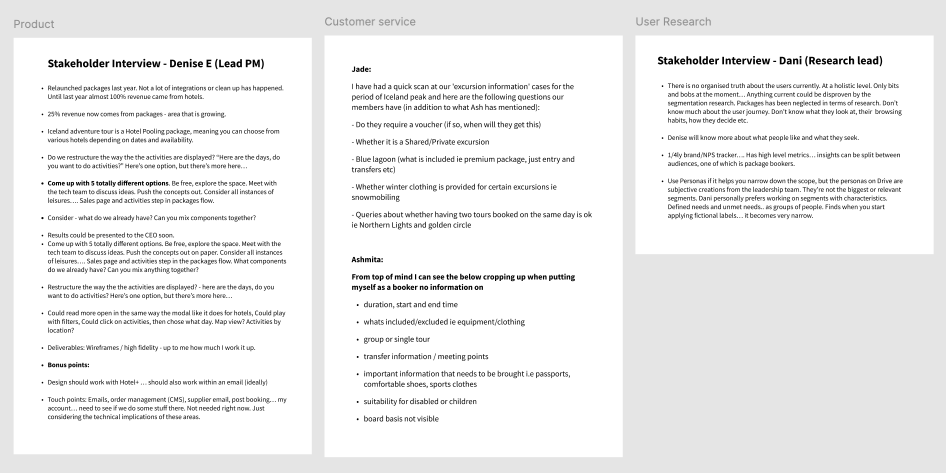
- I spoke with Lead PM to understand the commercial context of the project, what was in scope and what we were hoping to achieve.
- I spoke with the customer service team to learn some of the main complaints they get from members on the topic.
- They gave me a clear picture of the information gaps that were frustrating members and creating additional work for the business.
2
Heuristics & Guidelines
- I conducted a heuristic mark-up of the current experience, noting my observations and gut reactions to the experience.
- Baymard Institute had a huge repository of information on this topic, which allowed me to validate the requirements that had come from the Customer Service team.
- I also referenced Think With Google's research on the psychology and behaviour behind e-commerce purchase decisions.
3
Secondary research
- I spoke to the UX Research Lead to understand the target users and the problem space.
- She shared 2 insight reports with me and recommended I viewed some of the moderated sessions she’d ran on usertesting.com.
- I learnt that package bookers have two key drivers: lean forward (challenge, stimulation, learning) and lean back (rest, calm, escape from routine). The best itineraries balance them deliberately.
4
Moderated interviews
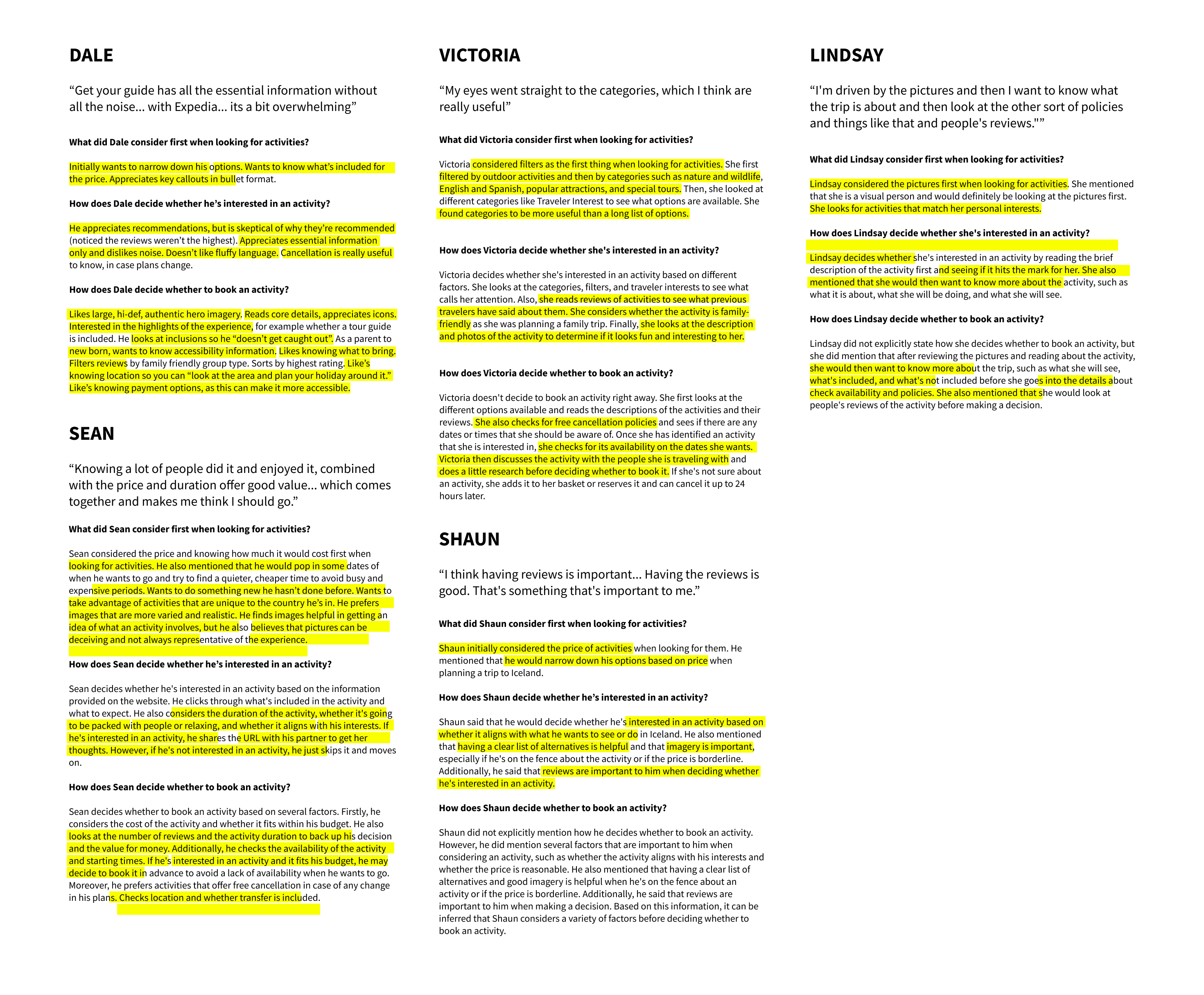
- I interviewed 5 target users to understand how they think about trip activities and what they need to make a decision about a purchase or upgrade.
- They walked me through the process of discovering and deciding on activities for a mock trip using 3 competitor products: customers navigated activity selection on TripAdvisor, GetYourGuide and Expedia.
- Three consistent themes emerged:
- Personal interest drove attachment more than any other factor. When an activity matched what the participant wanted to do, they were willing to spend more.
- Duration was a proxy for value. Without it, customers couldn't assess whether an activity was worth the price or fit their plans.
- People want proof. Authentic, high-quality activity photography built confidence, and reviews provided the credibility needed to convert.
The problem space
I had uncovered a tonne of issues. The current experience fell well short of what users and the industry considered a baseline standard for an activity booking experience.
I walked my product partner through the problem space, discussing each problem and note taking about the positive and negative aspects of each issue.
Many of the issues discovered were outside the scope of this project. Instead of losing them, I created a Google Sheet that documented all the issues I’d discovered and shared it with the PM. A useful research artefact for another day.
I distilled the in scoped issues into key themes. Together with Product and Engineering we mapped the themes to an impact vs. effort matrix, to understand which problems were worth focusing on first.
Speaking with the technical team, it became clear the underlying problem was a lack of structured data. With a third-party integration on the mid-to-long term roadmap, any design changes needed to work within the current data structure rather than rely on significant engineering effort.
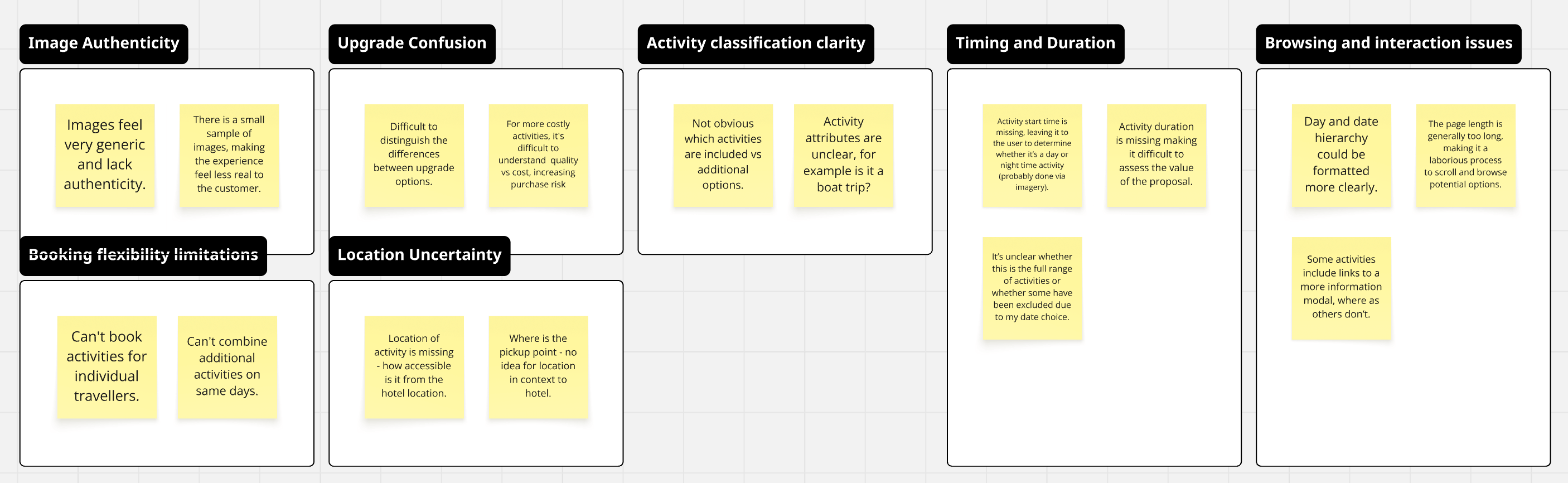
Rather than pushing for a radical overhaul, we aimed for incremental buy-in from stakeholders, focusing on the following problems:
- Browsing & Interaction Issues
- Upgrade Confusion
- Lack of Timing & Duration Information
- Activity Classification Clarity
- Location Uncertainty
Opportunities
As a package traveller with a set itinerary, I need clarity on how additional activities fit into my overall schedule, so that I can choose activities confidently without overbooking myself.
A key UX decision was the information architecture. Stakeholders wanted to lead with the full breadth of available activities, but research was clear: users care most about their itinerary and whether activities fit their schedule.
I explored an activity-first approach, but within the context of the multi-step package sales-flow, it felt overwhelming and clunky. Once stakeholders saw an activity first experience visualised within context of the sales-flow they agreed, “it felt too complex”.
Dates-first gave the decision-making process a natural structure. Users could see availability mapped across their itinerary, then choose to dive in or save a day for relaxation – offering the ideal balance.
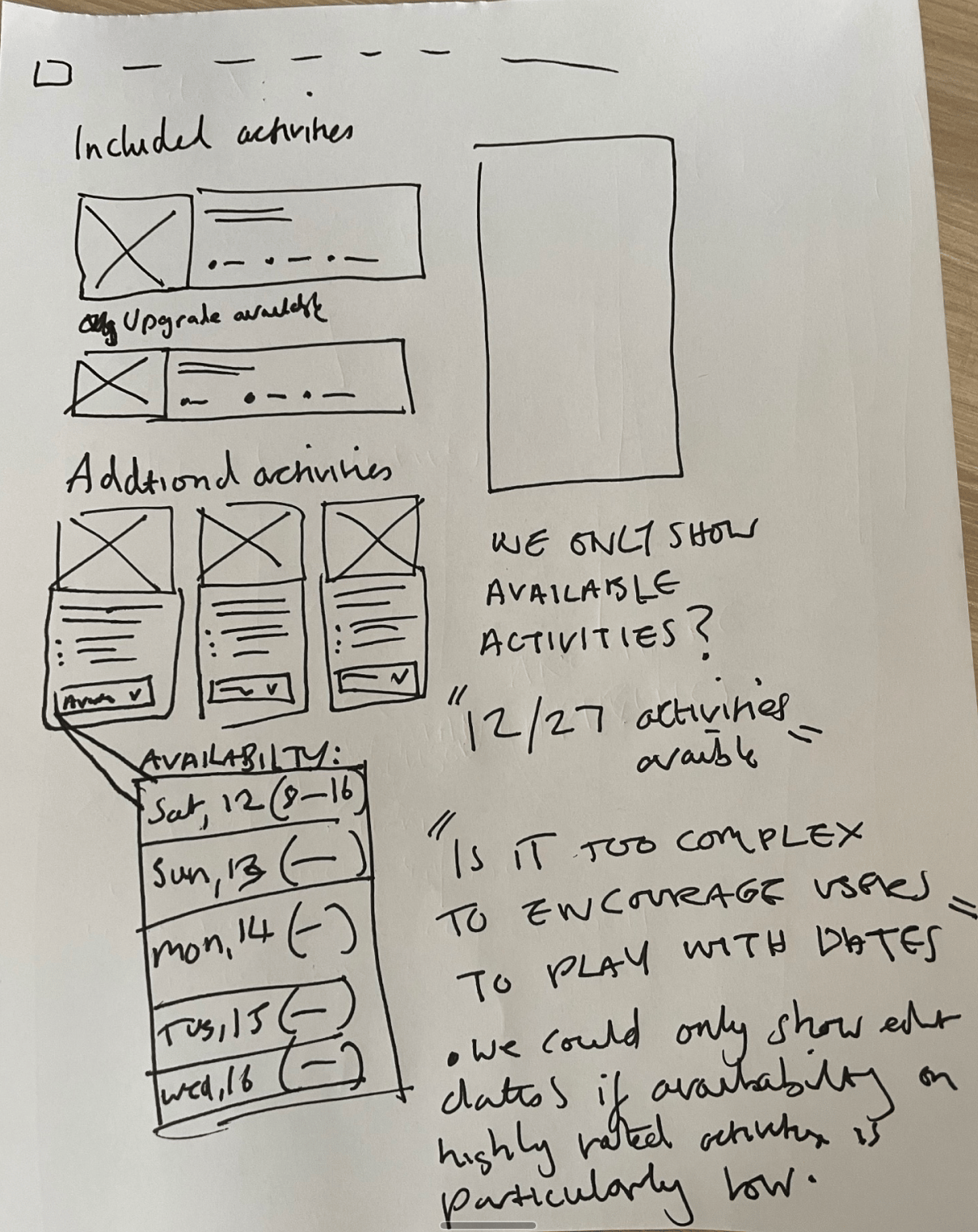
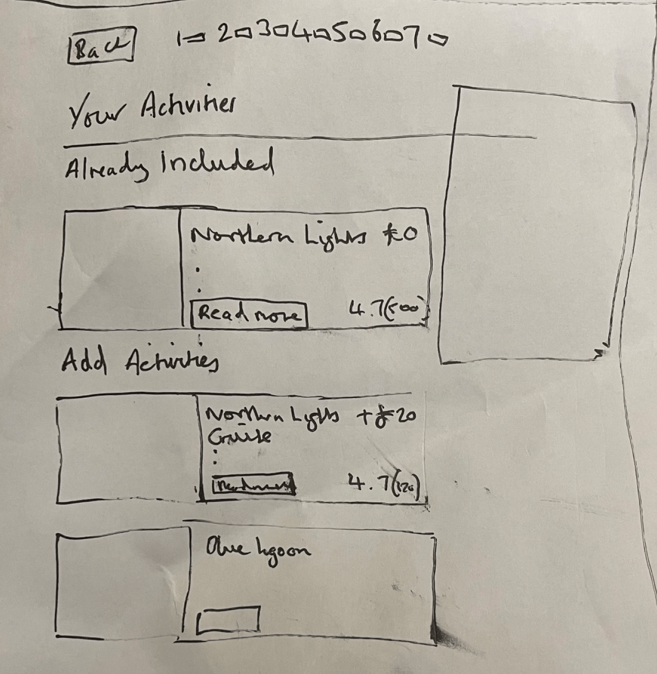
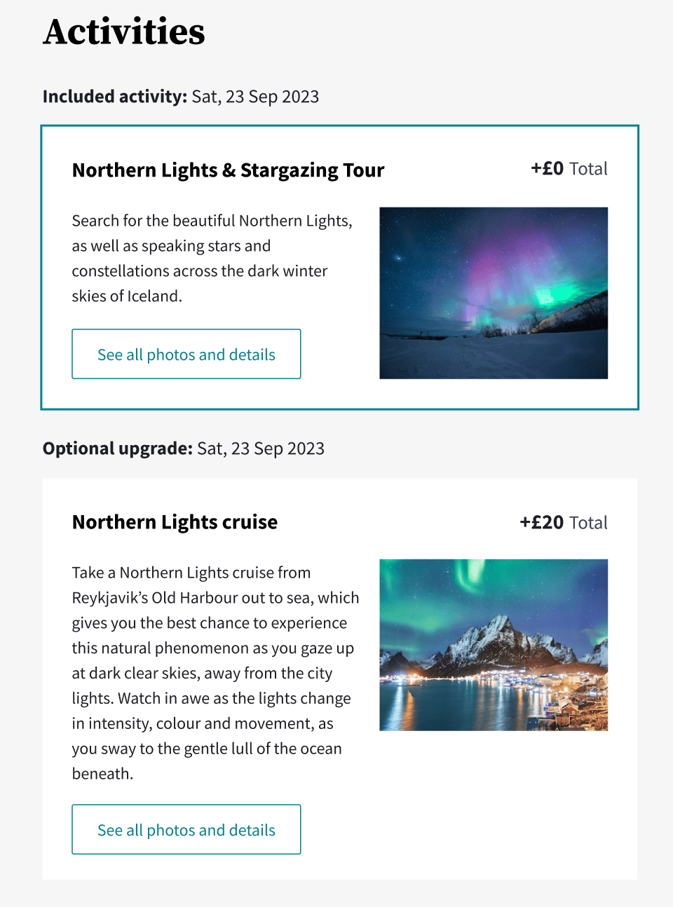
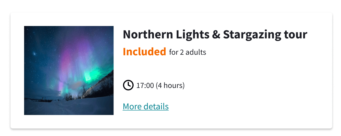
As a value-conscious traveller, I need clear visibility of which activities are included and which are optional upgrades so that I can understand the value of my package and know how much time I have for additional activities.
Included activities are always listed before additional activities. The previous design didn’t make it obvious as to why these activities were listed before the other options.
As we knew from the packages insight study “the experience is the hero for package holidays” - so making sure the included activities are immediately visible was important.
Rather than moving their placement, we wanted to ensure their value was clearly understood. I explored variations of label placement and wording to create clarity for users.
As a package traveller who wants a mix of rest and activity, I need clear expectations of what each activity entails, so I can curate my itinerary without over-committing.
Balancing activity with rest is dynamic and can't always be planned in advance. Within the pre-booking experience, a few approaches were considered:
- Curation – choosing a blend of activities that offer both.
- Filtering – surfacing preference data rather than assuming it.
- Relaxation slider: a control that populates the activity list based on a spectrum from active to restful.
The dates-first solution supports this too. In testing, one participant put it well: they could picture booking an activity one day, a day by the pool the next, then another activity after that. Relaxation doesn't have to be something you book.
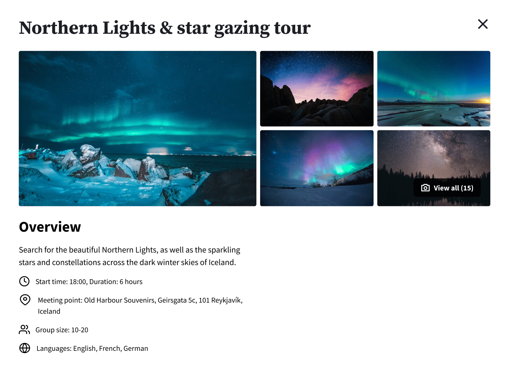
As a value-conscious traveller, I want to know how long each activity lasts, so I can judge whether it's worth the price.
Duration was a strong requirement. I was quite surprised that it hadn’t been picked up previously. As it’s obviously quite hard to determine the value of an activity without knowing how long it’s going to last.
Baymard Institute clearly confirmed this as a requirement for customers looking to book tours. This information needed to be visible at a card level, allowing the user to compare durations and prices simultaneously across activity options.
Validation
Desktop and mobile prototypes were each tested with 12 participants via unmoderated testing. Both hypotheses were confirmed.
What worked
The dates-first format landed well on both platforms — users described it as intuitive, comparing it to a calendar or itinerary builder. Activity detail modals were easy to navigate and the list-based format was well liked. Duration proved critical: users consistently referenced it alongside price to judge value for money. Strong photography also had a noticeable impact on desirability, with several participants commenting that imagery alone made them want to book.