

Back

Optimising AI search to help members find relevant deals faster
My role
Role
Product Design
Team
Data, Design, Engineering
Platforms
Web (Desktop & Mobile)
Timeline
28 - 29 May 2026
Context
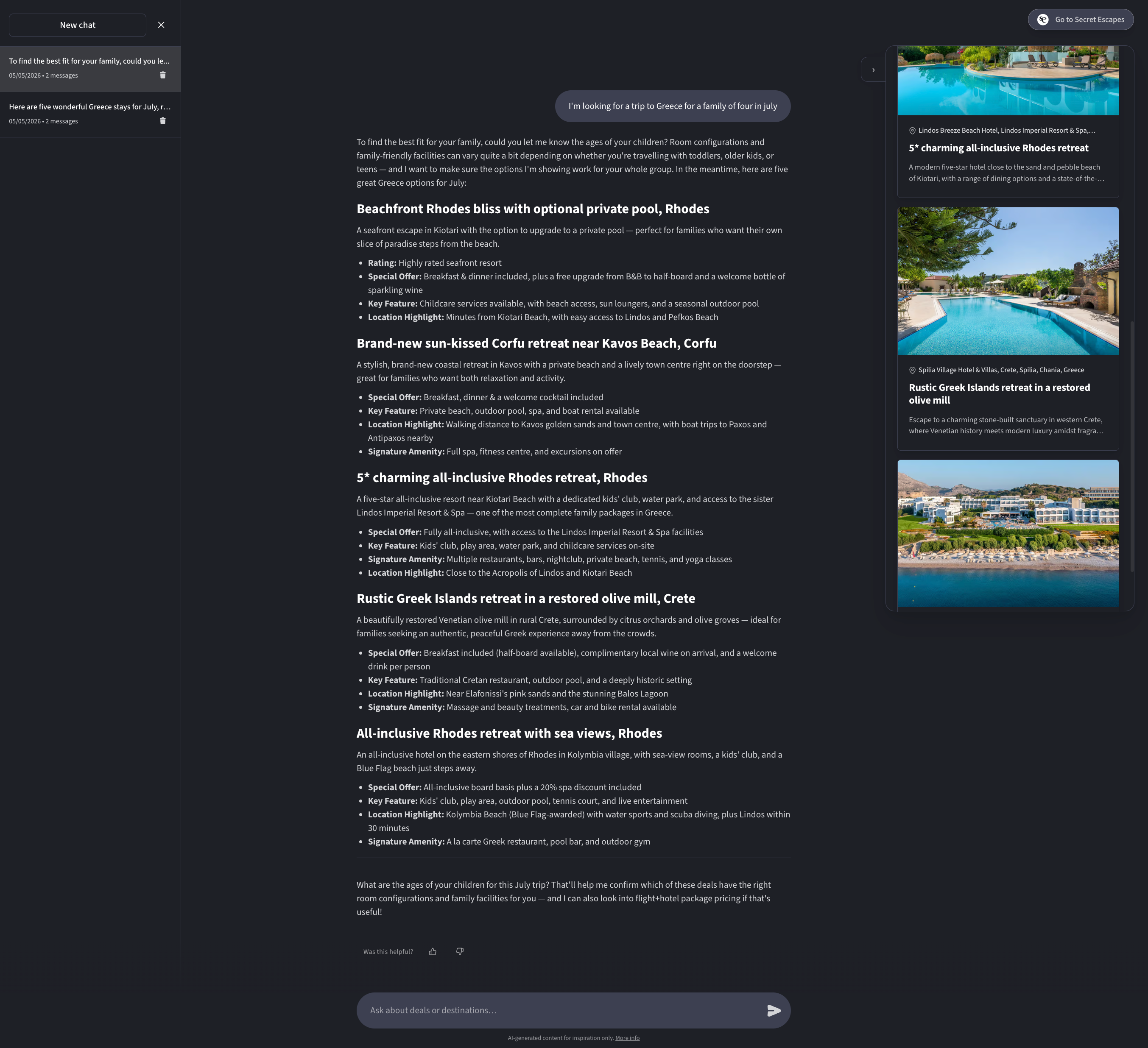
Secret Escapes had launched a AI search feature that allowed members to describe their perfect trip in natural language and see hotel and package deals that matched.
The feature had been through several iterations already and was now being A/B tested on Production.

The opportunity
A/B results showed that members who engaged with AI search were more likely to go on to book, driving an increase in conversion rate.
This a very interesting finding that encouraged the business to invest more in developing the feature further, and driving more members towards using it as a search method.
Challenges
I worked on the project in two parts. The first was feature prominence – Making AI search more visible on the homepage. The second part was was optimising the search results once the user had engaged, aiming to drive a higher conversion rate.
1
Unlike direct supply that has lead pricing – bed banks require dates to be added before pricing can be shown
How might we ensure pricing is available for bed bank deals during search?
Homepage prominence
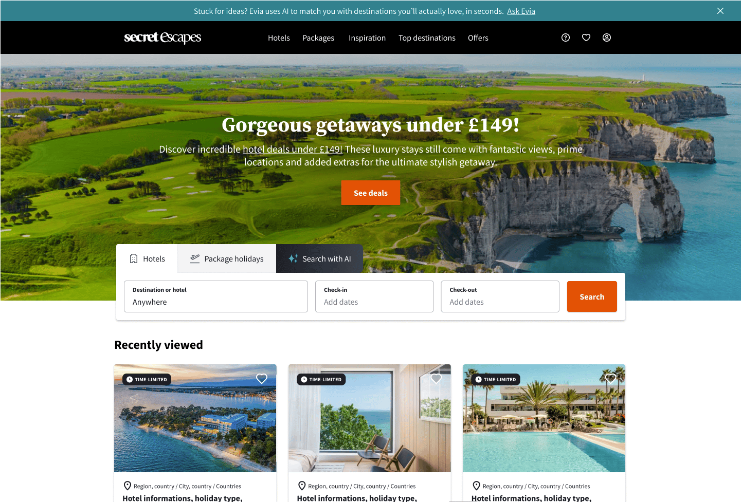
After some consideration the homepage was the page I focussed on to advertise the AI search feature to maximise visibility for new and returning users beginning their search journey.
The feature needed to feel different to the product line tabs and be contextually placed to fit within the user’s decision hierarchy.
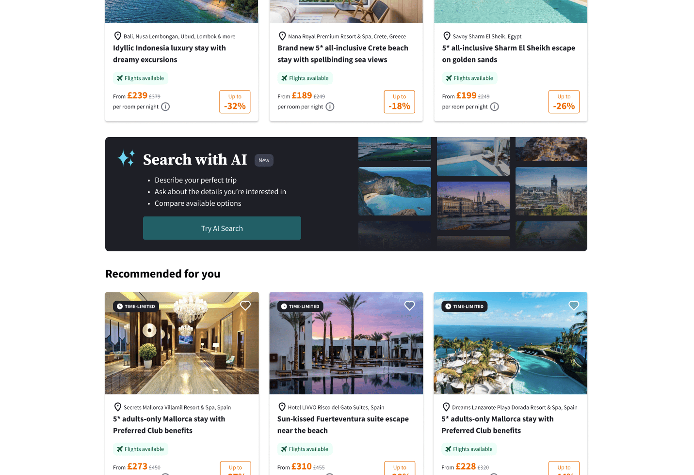
Driving engagement
We agreed that the homepage would be the best location to advertise the AI search feature. The feature needed to stand out from the other product line tabs, yet be contextually placed to fit within the user’s decision heirarchy.
The Focused Comparer
Driver
- Avoid search fatigue.
Goal
- Efficiently compare a focused set of options against each other/
Needs
- Understand the unique value of available options.
- Understand the value-for-money of available options.
- Compare options efficiently.
- Trust that deals are relevant before engaging.
Prioritisation for maxium impact
- Current behaviour indicated the predominant use case was finding and refining a deals
- I decided the ‘Focused Comparer’ was the highest impact user group to focus our time and effort on.
- From a business perspective we wanted to enable members to effectively decide on a shortlist and go onto book.
1 to 3
Conversational turns on average
Decision not discovery
Users knew what they were looking for
Identifying usability issues
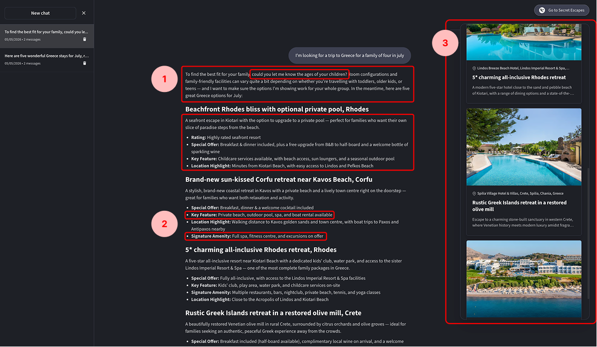
- Elissa’s response and the deals it’s returning, look very similar (all text). This creates friction and fatigue across multiple turns and makes follow up questions easy to miss.
- Deal information like ‘Signature amenity’ and ‘Key feature’ share similar content and are labelled quite technically. This makes understanding the differences between deals more challenging.
- The placement of sales cards on the right and content within the page body makes them feel
- It’s not clear what product type each deal is.
- General information overload. There’s so much information to proc ess, that making a decision feels overwhelming.
Design challenges
I explored lo-fi concepts seeking feedback from cross-functional partners. The designs aimed to address issues I had discovered, aligning with the target user’s needs with the primary goal of supporting more efficient decision making.
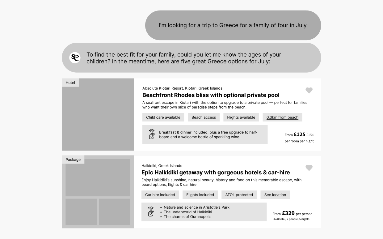
Improving clarty with content structure
- Follow up responses are clearly called out, using a logo icon to signal the AIs response distinctly, and aligning more closely a more familiar mental model of digital conversations.
- Deal content uses a single card design, consistent with the regular search experience, building familiararity and trust.
- I removed repetitive and long form content from deal descriptions, instead focusing on highlighting key information.
- Key features were dynamic, surfacing the most relevant information in relation to the users search criteria or default content.
- Inclusions are highlighted as hero content.
- Pricing is added to support effective decision making.
- A shortlist feature is added to support deal comparison.
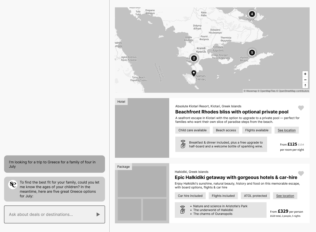
Alternative layout
- I explored another concept, splitting conversation and deal content into a 2 column layout.
- I felt it might be too complex for the average holiday seeker. Further research would of helped decide a direction.
- With a relatively short number of conversation turns this interface could be better suited to longer form conversations.
- We considered introducing a map view, but with no usage data to justify it, that decision needed more insight than we had and would have expanded the scope of the work.
Design proposal
After a final discussion with my cross-functonal partners, I handed off a working prototype I built in Claude Code, and a detailed specification list for the engineer to work from.
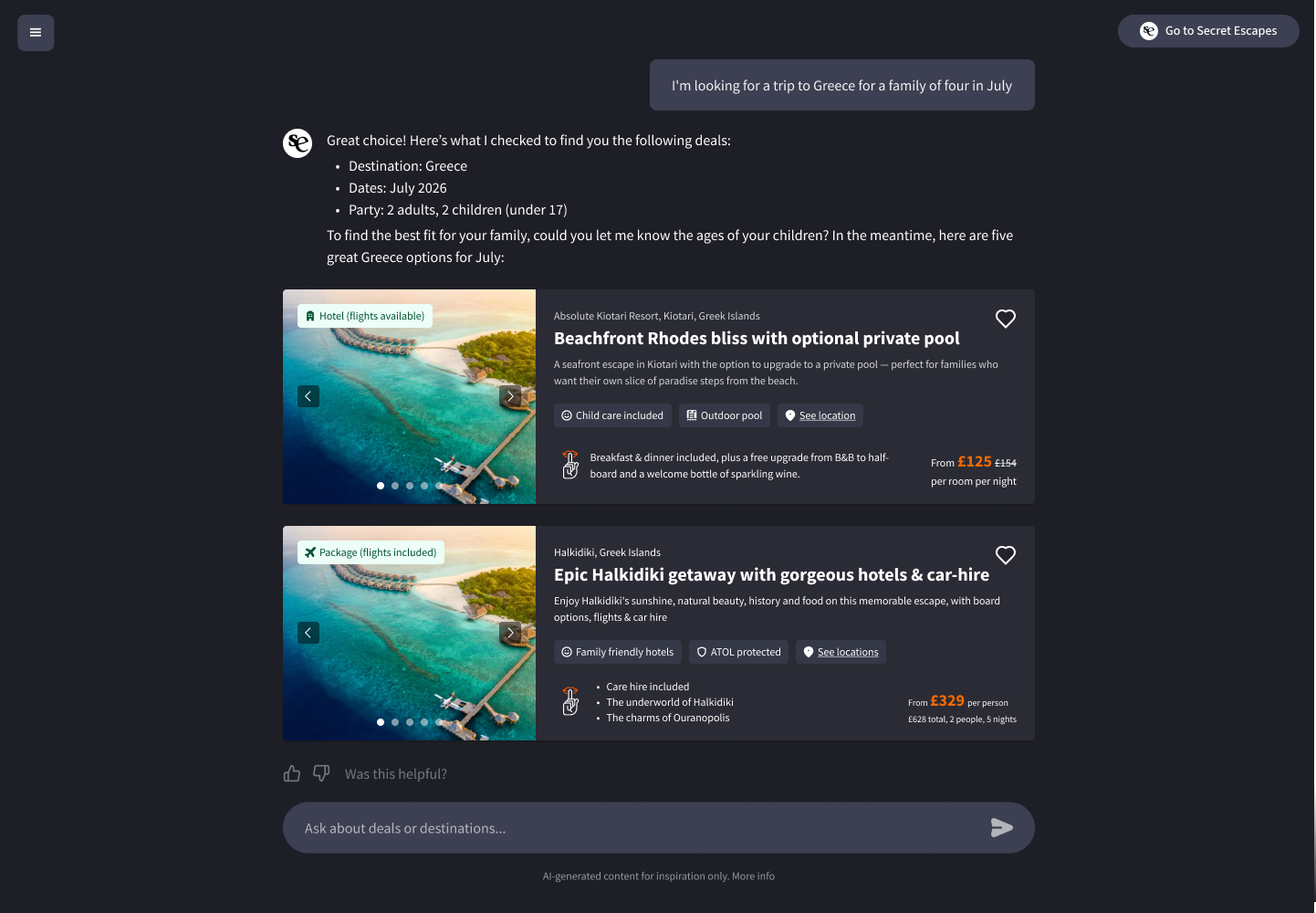
Final concept
- An improved response structure clarifies the user’s search criteria and follow up questions
- A feedback widget captures a signal of how useful members were finding the search experience
- Together we planned our presentation for the Hack-day show and tell session
- Data kicked off, laying the foundational context. I followed with my thinking and conceptual work. Engineering finished with a demo of the working prototype – Teamwork!
Outcomes
The feedback from the Product and Engineering team was really positive. The missing discounts were questioned. Further research should be conducted to determine the importance of discounts during search.
The updates were later released to production with the data team later informing us that since the changes the conversion rate achieved via AI search had increased considerably.
This validated our concept as a meaningful improvement for members and an important metric for the business.
Average conversion rate for AI search users increased
Back
Optimising AI search to help members find relevant deals faster
My role
Role
Product Design
Team
Data, Design, Engineering
Platforms
Web (Desktop & Mobile)
Timeline
28 - 29 May 2026
Context
Secret Escapes had launched a AI search feature that allowed members to describe their perfect trip in natural language and see hotel and package deals that matched.
The feature had been through several iterations already and was now being A/B tested on Production.
The opportunity
A/B results showed that members who engaged with AI search were more likely to go on to book, driving an increase in conversion rate.
This a very interesting finding that encouraged the business to invest more in developing the feature further, and driving more members towards using it as a search method.
Design challenges
I worked on the project in two parts. The first was feature prominence – Making AI search more visible on the homepage. The second part was was optimising the search results once the user had engaged, aiming to drive a higher conversion rate.
1
Unlike direct supply that has lead pricing – bed banks require dates to be added before pricing can be shown
How might we ensure pricing is available for bed bank deals during search?
Homepage prominence
After some consideration the homepage was the page I focussed on to advertise the AI search feature to maximise visibility for new and returning users beginning their search journey.
The feature needed to feel different to the product line tabs and be contextually placed to fit within the user’s decision hierarchy.
Driving engagement
We agreed that the homepage would be the best location to advertise the AI search feature. The feature needed to stand out from the other product line tabs, yet be contextually placed to fit within the user’s decision heirarchy.

The Focused Comparer
Driver
- Avoid search fatigue.
Goal
- Efficiently refine and compare set of specific options and shortlist potential deals.
Needs
- Understand the unique value of available options.
- Understand the value-for-money of available options.
- Compare options efficiently.
- Trust that deals are relevant before engaging.
Target audience
- Current behaviour indicated the predominant use case was finding and refining a deals
- I decided the ‘Focused Comparer’ was the highest impact user group to focus our time and effort on.
- From a business perspective we wanted to enable members to effectively decide on a shortlist and go onto book.
1 to 3
Conversational turns on average
Decision not discovery
Users knew what they were looking for
Identifying usability issues
- Elissa’s response and the deals it’s returning, look very similar (all text). This creates friction and fatigue across multiple turns and makes follow up questions easy to miss.
- Deal information like ‘Signature amenity’ and ‘Key feature’ share similar content and are labelled quite technically. This makes understanding the differences between deals more challenging.
- The placement of sales cards on the right and content within the page body makes them feel
- It’s not clear what product type each deal is.
- General information overload. There’s so much information to proc ess, that making a decision feels overwhelming.
Design challenges
I explored lo-fi concepts seeking feedback from cross-functional partners. The designs aimed to address issues I had discovered, aligning with the target user’s needs with the primary goal of supporting more efficient decision making.
Improving clarty with content structure
- Follow up responses are clearly called out, using a logo icon to signal the AIs response distinctly, and aligning more closely a more familiar mental model of digital conversations.
- Deal content uses a single card design, consistent with the regular search experience, building familiararity and trust.
- I removed repetitive and long form content from deal descriptions, instead focusing on highlighting key information.
- Key features were dynamic, surfacing the most relevant information in relation to the users search criteria or default content.
- Inclusions are highlighted as hero content.
- Pricing is added to support effective decision making.
- A shortlist feature is added to support deal comparison.
Alternative layout
- I explored another concept, splitting conversation and deal content into a 2 column layout.
- I felt it might be too complex for the average holiday seeker. Further research would of helped decide a direction.
- With a relatively short number of conversation turns this interface could be better suited to longer form conversations.
- We considered introducing a map view, but with no usage data to justify it, that decision needed more insight than we had and would have expanded the scope of the work.
Design proposal
After a final discussion with my cross-functional partners, I handed off a working prototype I built in Claude Code, and a detailed specification list for the engineer to work from.
Final concept
- An improved response structure clarifies the user’s search criteria and follow up questions
- A feedback widget captures a signal of how useful members were finding the search experience
- Together we planned our presentation for the Hack-day show and tell session
- Data kicked off, laying the foundational context. I followed with my thinking and conceptual work. Engineering finished with a demo of the working prototype – Teamwork!
Outcomes
The feedback from the Product and Engineering team was really positive. The missing discounts were questioned. Further research should be conducted to determine the importance of discounts during search.
The updates were later released to production with the data team later informing us that since the changes the conversion rate achieved via AI search had increased considerably.
This validated our concept as a meaningful improvement for members and an important metric for the business.
Average conversion rate for AI search users increased


Back
Optimising AI search to help members find relevant deals faster
My role
Role
Product Design
Team
Data, Engineering, Design
Platforms
Web (Desktop & Mobile)
Timeline
28 - 29 May 2026
Context
Secret Escapes had launched a AI search feature that allowed members to describe their perfect trip in natural language and see hotel and package deals that matched.
The feature had been through several iterations already and was now being A/B tested on Production.
The opportunity
A/B results showed that members who engaged with AI search were more likely to go on to book, driving an increase in conversion rate.
This a very interesting finding that encouraged the business to invest more in developing the feature further, and driving more members towards using it as a search method.
Design challenges
I worked on the project in two parts. The first was feature prominence – Making AI search more visible on the homepage. The second part was was optimising the search results once the user had engaged, aiming to drive a higher conversion rate.
1
We know users who engage with AI search have a higher chance of conversion
How might we encourage users to engage with AI search?
Homepage prominence
After some consideration the homepage was the page I focussed on to advertise the AI search feature to maximise visibility for new and returning users beginning their search journey.
The feature needed to feel different to the product line tabs and be contextually placed to fit within the user’s decision hierarchy.
Driving engagement
To further drive engagement a banner was placed within a high activity area near the top of the page.
I enhanced design by highlighting the benefits of AI search and using a mixture of beach and city led destination imagery.
I explored different language but internal feedback steered me towards accessible, action oriented language – Search with AI.
2
We know there are a lot of improvements that could be made, but where should we focus for maximum impact?
How might improve the efficiency of decision making for members?
1 to 3
Conversational turns on average
Decision not discovery
Users knew what they were looking for
The Focused Comparer
Driver
- Avoid search fatigue.
Goal
- Efficiently refine and compare set of specific options and shortlist potential deals.
Needs
- Understand the unique value of available options.
- Understand the value-for-money of available options.
- Compare options efficiently.
- Trust that deals are relevant before engaging.
Target audience
- Current behaviour indicated the predominant use case was finding and refining a deals
- I decided the ‘Focused Comparer’ was the highest impact user group to focus our time and effort on.
- From a business perspective we wanted to enable members to effectively decide on a shortlist and go onto book.
Identifying usability issues
- Very text heavy
- Key features has to distinguish
- Separation between deal content and sales cards
- Product types weren’t clear
- General information overload
- Not a superior search experience.
Design exploration
I explored lo-fi concepts seeking feedback from cross-functional partners. The designs aimed to address issues I had discovered, aligning with the target user’s needs and the primary goal of supporting more efficient decision making.
Improving clarity with better content structure
- Follow up responses are clearly called out
- Chat aligns more closely mental model of digital conversations
- Card design consistent with regular search experience
- Reduction of key deal information
- Key information is dynamic, surfacing the most relevant information
- Inclusions are highlighted as hero content
- Pricing supports effective decision making
- A shortlist feature aids deal comparison
Alternative layout
- I explored another concept, splitting conversation and deal content into a 2 column layout.
- I felt it might be too complex for the average holiday seeker. Further research would of helped decide a direction.
- With a relatively short number of conversation turns this interface could be better suited to longer form conversations.
- We considered introducing a map view, but with no usage data to justify it, that decision needed more insight than we had and would have expanded the scope of the work.
Design proposal
After a final discussion with my cross-functional partners, I handed off a working prototype I built in Claude Code, and a detailed specification list for the engineer to work from.
Final concept
- An improved response structure clarifies the user’s search criteria and follow up questions
- A feedback widget captures a signal of how useful members were finding the search experience
- Together we planned our presentation for the Hack-day show and tell session
- Data kicked off, laying the foundational context. I followed with my thinking and conceptual work. Engineering finished with a demo of the working prototype – Teamwork!
Outcomes
The feedback from the Product and Engineering team was really positive. The missing discounts were questioned. Further research should be conducted to determine the importance of discounts during search.
The updates were later released to production with the data team later informing us that since the changes the conversion rate achieved via AI search had increased considerably.
This validated our concept as a meaningful improvement for members and an important metric for the business.
Average conversion rate for AI search users increased